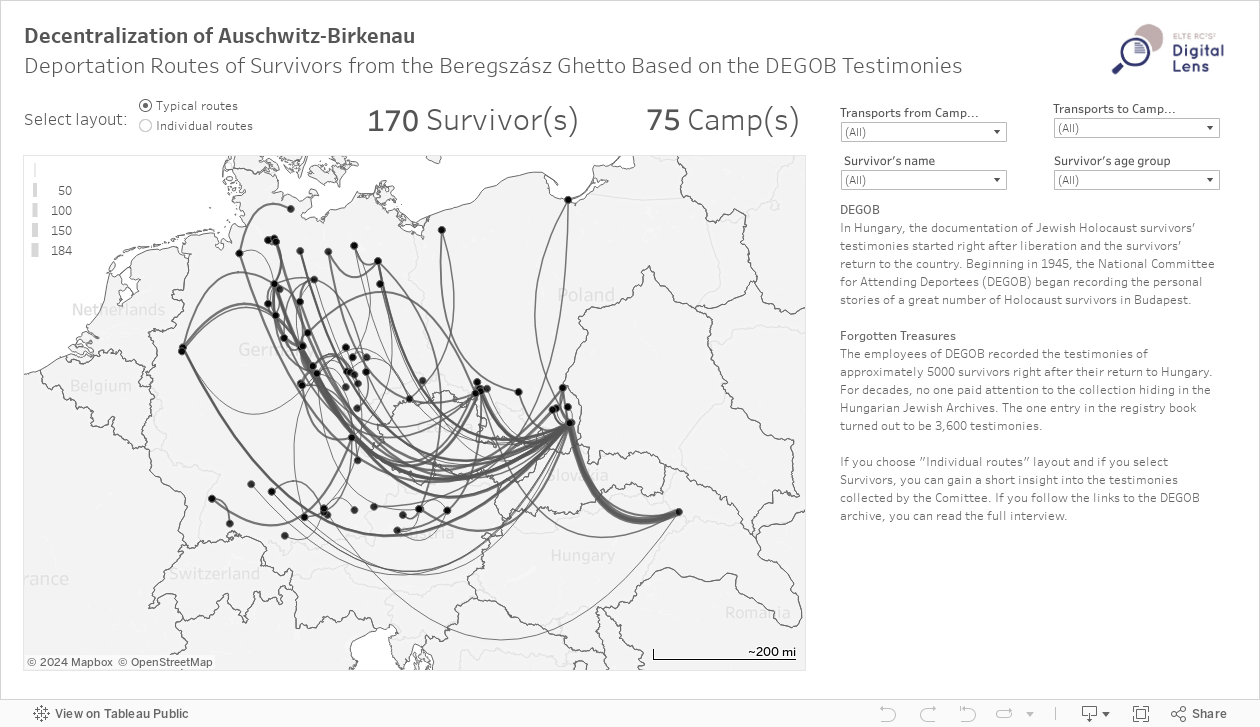
This flow map uncovers how Auschwitz was not the final destination of deportations for the survivors.
Data visualizations can be created generally for two purposes. The first is to explore data in order to find new research questions, familiarize oneself with data, and to find patterns. The second purpose is to have a tool that explains the findings. For these reasons, our charts are both exploratory and explanatory. The visualizations we create are not only illustrations but convey knowledge about the Holocaust. This flow map uncovers how Auschwitz was not the final destination of deportations, as much of geographical historiography on Hungarian Jews has so far suggested.
On the Tableau dashboard, there are two different layouts. This one is like the previous flow chart but shows geographical information as well (if you pay close attention, you can see, that today’s borders and those from 1944 are present at the same time). When building this dashboard, we had some ethical considerations in mind: is it acceptable to show big numbers on our visualization? Should we display the names of survivors? Wouldn’t it be better to separate the lines, so that all fates can be individually represented on the map simultaneously?
Through the filtering option, you can see different fates of the survivors and get to know more about their personal stories.